Fresh Living Room Paint Trends for 2026
The living room is where people relax, entertain guests, and express personal style, which makes color selection especially important. A fresh coat of paint can completely change how the room feels without requiring a large investment. The right color can make a space feel larger, warmer, brighter, or more luxurious, depending on your goal. Paint color often serves as the foundation that ties together furniture, flooring, and décor.
For rentals and managed properties, fresh paint helps spaces look clean, modern, and well cared for. Updated colors can make a property more appealing to tenants and visitors while helping it stand out in a competitive market. Because the living room is typically one of the first spaces people notice, choosing the right color has a big impact on first impressions.
2026 Color Trends for Living Rooms
Design forecasts for 2026 point toward richer, warmer colors replacing the cooler grays that dominated previous years. Olive greens, soft clay pinks, and deep sapphire blues are becoming popular for living room walls because they add depth and personality. Olive green brings a grounded, natural feel and works well as both a full-room color or an accent. Soft clay tones act as warm neutrals that feel cozy without overpowering the space.
Deep jewel tones are also gaining popularity, particularly dark blues like navy and midnight blue. These shades create a cocoon-like atmosphere that feels calm and sophisticated. Rich burgundy and oxblood red tones are another emerging trend, offering warmth and drama without the intensity of brighter reds.
Neutrals remain relevant, but they are shifting warmer. Instead of cool gray, expect to see more khaki, tan, taupe, and earthy beige tones. These warmer neutrals feel more inviting and natural, allowing wood finishes and textiles to shine while creating a comfortable backdrop. These trends are practical not only for homeowners but also for rentals, where updated colors can make a space feel modern and memorable.
Warm Neutrals and Earthy Tones
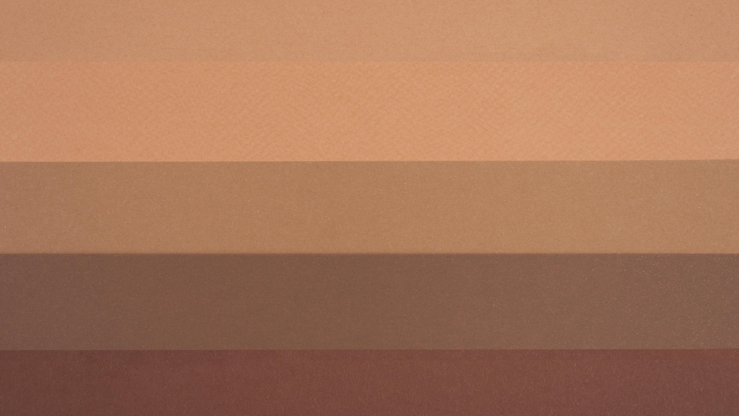
Warm neutrals like sand-toned beige, putty, and mushroom brown offer a softer alternative to traditional gray. These colors feel sophisticated and calming while still functioning as true neutrals. They pair especially well with wood furniture, woven textures, and natural fabrics, helping living rooms feel balanced and welcoming.
Soft clay and pink-beige shades are another option for adding warmth without overwhelming the space. These tones create a gentle glow and work beautifully with cream trim and natural fiber accents. Warm neutrals are ideal for homeowners and property managers because they provide character while remaining broadly appealing and easy to decorate around.
Nature-Inspired Greens and Blues

Greens and blues continue to dominate living room color trends, reflecting a desire to bring the outdoors inside. Olive and forest greens create a soothing, earthy feel and work well with wood floors and neutral furniture. These shades are versatile enough to feel bold while still acting as grounding neutrals.
Dark blues like navy and midnight blue add depth and drama while remaining cozy and approachable. These colors are especially effective on feature walls or in reading areas. Lighter blue-green shades, such as muted aqua or soft teal, bring a fresh and playful touch while maintaining a calm, natural feel. Greens and blues are widely appealing and work well across modern, traditional, and transitional spaces.
Rich Reds and Bold Accent Colors
Deep reds, burgundy tones, and clay-inspired hues are making a strong return in living room design. These colors create warmth and intimacy without feeling overpowering. Used on an accent wall, fireplace surround, or built-in shelving, rich reds add character and depth to the space.
Terracotta and clay tones also fit into this earthy trend, pairing beautifully with greenery, leather furniture, and warm metals. These shades work particularly well in rooms with plenty of natural light, where they enhance warmth and visual interest. Balancing bold colors with lighter neutrals keeps the room inviting and comfortable.
Bring Your Living Room to Life with the Right Paint Color
Refreshing your living room with paint is one of the easiest and most affordable ways to update your home. In 2026, warmer neutrals, earthy tones, and rich accent colors are shaping how living rooms feel and function. Whether you prefer a subtle beige, a calming green, or a bold navy, choosing the right color helps create a space that feels comfortable, stylish, and personal.
If you’re ready to bring these ideas to life, Stephen Radl Painting can help transform your living room with professional results. From subtle refreshes to bold statement walls, our team will work with you to find the perfect color and finish. Contact Stephen Radl Painting today to schedule a consultation and give your living room the fresh start it deserves.
FAQs
What paint color is best for a living room?
Neutral paint colors are the most popular choice for living rooms because they are versatile and timeless. Soft off-whites, warm grays, and light greige tones create an open, balanced feel that works with almost any décor style. These colors allow furniture, artwork, and textures to stand out without overwhelming the space. They also appeal to homeowners, renters, and property managers because they age well and suit many tastes.
Which color combination is best for a living room?
The best living room color combinations create the right mood, complement existing décor, and work well with lighting. Neutral pairings like gray and white or beige and olive offer a timeless look, while earth tones add warmth and depth. Blues and greens promote calm, while classic combinations such as black, white, and gold feel modern and polished. Always consider lighting and test samples to ensure the colors feel balanced throughout the day.
Which type of painting is good for a living room?
The best type of painting for a living room depends on your style and the atmosphere you want to create. Nature-inspired artwork brings a calm, relaxed feel, while abstract or geometric pieces suit modern and minimalist spaces. Traditional living rooms pair well with portraits, landscapes, or still lifes in classic frames. Artwork should complement the room’s color palette and be sized appropriately to maintain visual balance.
What are the best colors for a cozy living room?
Warm neutrals and earthy tones are ideal for creating a cozy living room. Soft beiges, warm whites, brown neutrals, and muted green-grays make the space feel comfortable and inviting. These colors pair well with natural textures like wood and linen. Cozy living rooms benefit from grounded, soothing shades rather than bright or stark colors.