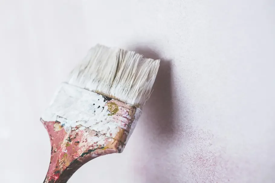
Best Living Room Paint Ideas for 2026
Hey there! I’m a professional painter, and if there’s one thing I’ve learned over the years, it’s this: the right paint color can completely change the way you feel in a living room. I’ve walked into spaces that felt dull and lifeless, applied a fresh coat of paint, and watched them come alive with personality and warmth. Choosing a color might seem tricky at first, with so many shades, finishes, and trends, but it doesn’t have to be stressful. Think of it as giving your living room a little personality boost.
I’ll share some of my favorite living room paint ideas, from timeless neutrals to bold statements, and give tips on how to pick colors that match your style, furniture, and the mood you want in your home. Whether you’re looking for something cozy and calming or vibrant and energizing, there’s a paint idea here that can make your living room a space you actually want to spend time in.
Why Your Living Room Color Matters
When clients call me, the first thing I ask is, “What mood do you want for your living room?” That’s because the color you choose affects everything from how big the room feels to how relaxed or energized you’ll feel when you’re in it. Lighter shades tend to make a room feel more open and airy, while darker tones can make it feel cozy and intimate.
Your living room is often the center of activity in your home, and the paint you pick can set the tone for the entire space. For instance, a soft neutral can provide a calm backdrop for furniture and art, while a bold hue can create a statement and reflect your personality.
Classic Neutral Paint Colors
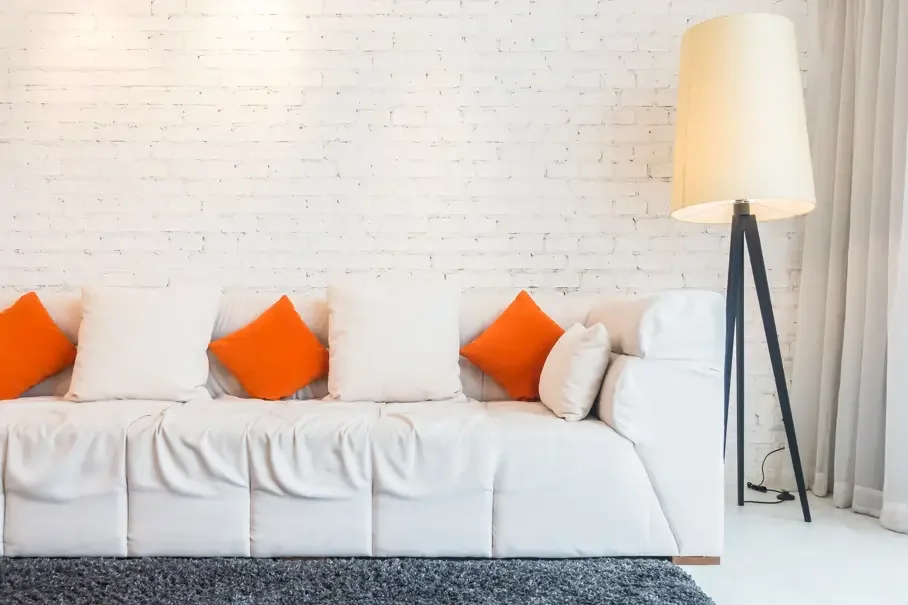
If you’re unsure where to start, neutrals are always a safe bet. Soft grays, warm beiges, and creamy whites can complement almost any style of furniture or décor. Personally, I love using a soft gray in a living room because it adds depth without feeling heavy. Plus, it’s versatile; you can add pops of color through pillows, rugs, or artwork.
Another popular option is beige or taupe. These shades give a warm, welcoming feel and are perfect if your living room gets lots of natural light. A neutral base also makes it easy to switch up accent colors over the years without repainting the whole room.
Bold Colors That Make a Statement
For clients who want their living room to feel lively and full of personality, bold colors can be a great choice. Think deep navy, emerald green, or even a rich terracotta. These colors work well as feature walls, paired with lighter neutral walls to avoid overwhelming the room.
I once painted a client’s living room a deep forest green, and the transformation was incredible. The room felt cozy yet elegant, and it perfectly highlighted their wood furniture and gold accents. Bold colors can be intimidating, but with the right balance, they can turn a living room into a space you never want to leave.
Pastel and Soft Shades for a Calm Vibe
If you prefer a lighter, more tranquil feel, pastel colors might be the way to go. Soft blues, mint greens, and blush pinks can make a room feel airy and peaceful. I often recommend pastel walls for living rooms that double as reading or relaxing spaces because these colors have a soothing effect.
Pastels pair beautifully with natural textures like wood, linen, and wicker. They’re also versatile enough to allow you to experiment with brighter accents, like a patterned rug or colorful cushions, without clashing.
Using Two-Tone or Accent Walls
Two-tone walls are one of my favorite techniques to add interest without going overboard. You can paint the lower half of the wall a darker shade and the upper half a lighter color, or choose one wall as an accent. This approach works especially well in living rooms with open floor plans or larger walls that need definition.
Accent walls can be subtle, like a slightly darker gray, or bold, like a deep navy or forest green. Either way, it draws the eye and gives your living room a layered, dynamic feel.
Warm vs. Cool Colors
Choosing between warm and cool colors is all about the mood you want. Warm tones like terracotta, soft gold, or coral make a room feel inviting and cozy, while cool tones like blues, greens, and lavender create a calm, refreshing atmosphere.
When I work with clients, I often suggest considering the lighting in the room. Natural sunlight tends to make warm colors pop, while cool shades work beautifully in rooms with less light.
Trending Colors for 2026
If you’re curious about what’s popular right now, earthy tones and muted shades are trending for 2026. Think sage green, clay, soft mustard, and dusty blue. These colors feel modern and sophisticated, yet they remain timeless enough that you won’t feel outdated in a few years.
These trends aren’t just showing up on job sites; they’re being echoed by designers nationwide. In The Spruce article “7 Trendy Paint Colors for Every Room in 2026, According to Designers,” experts highlight a clear shift toward warm, nature-inspired, and richly saturated hues for 2026. Colors like deep inky blues, earthy greens, terracotta, khaki neutrals, yellow ochre, and jewel tones dominate designers’ lists and many brands’ 2026 Colors of the Year, signaling a move away from cool minimalism toward living room colors that feel grounded, expressive, and genuinely livable
I recently painted a living room in a muted clay color, and the homeowner loved how it balanced warmth and elegance. Pairing these shades with white trim or wood accents gives a polished, stylish finish.
Textured and Specialty Finishes
While most living rooms are painted in flat or satin finishes, I sometimes recommend textured or specialty finishes for clients looking to add dimension. Techniques like sponging, rag-rolling, or metallic finishes can make walls more interesting without adding extra furniture or décor.
One of my favorite projects involved a subtle metallic finish in a living room. It reflected light in the morning and evening, creating a soft glow that made the space feel more dynamic. These finishes require professional skills to execute properly, but the results are always worth it.
Pairing Paint with Furniture and Flooring
When picking a living room color, always think about your furniture and flooring. A dark wood floor can pair beautifully with soft neutrals or deep, rich colors, while light hardwood or tile works well with pastel or bold tones.
I usually bring paint samples into the client’s living room and observe how the color changes with different lighting throughout the day. It’s amazing how a shade that looks perfect in the store can feel completely different under natural light at home.
Creating Focal Points with Color
You don’t have to paint every wall the same color. Using color strategically to create a focal point can make your living room more interesting. For example, painting the wall behind your TV, fireplace, or a large piece of art in a contrasting shade draws attention where you want it.
I once helped a client choose a deep teal wall behind their fireplace. The contrast with the neutral walls made the fireplace pop and gave the room a designer feel without being over the top.
Consider the Room’s Purpose
Another tip I give clients is to think about how the living room is used. If it’s a high-traffic area where the family gathers for games or movies, you might prefer a slightly darker color that hides scuffs and fingerprints. If it’s a formal sitting area, lighter or more dramatic colors can create a refined, stylish atmosphere.
The paint you choose should support how you want to feel in the room. It’s not just about looks; it’s about creating a space that feels right for your lifestyle.
Lighting Matters
I can’t stress this enough: lighting changes everything. A color that looks perfect in bright daylight can feel dull in the evening under artificial lighting. Always test your paint samples at different times of the day to see how the color interacts with light in your living room.
Consider combining overhead lights with lamps and sconces to bring out the best in your paint color. This simple adjustment can make even a basic color feel warm, cozy, or vibrant depending on your preference.
Tips for Picking the Right Color
Here are some practical tips I share with clients when choosing a living room color:
Test samples on your wall: Paint a few large patches before committing.
Consider your furniture: Make sure the color complements your existing pieces.
Think about mood: Do you want calm, cozy, vibrant, or elegant?
Don’t ignore ceilings and trim: These details can make a big difference.
Check lighting: Observe the color at different times of day.
DIY vs. Hiring a Professional Painter
While DIY painting is possible, I often recommend hiring a professional for a flawless finish. We know the tricks to avoid streaks, drips, and uneven coverage. Plus, professionals can suggest color combinations and finishes that you might not have considered.
In my experience, the right painter doesn’t just apply color; they bring your vision to life. Working with someone who understands lighting, textures, and design can make a huge difference in the final result.
Final Thoughts on Living Room Paint Ideas
Choosing the perfect living room paint color can feel overwhelming, but it doesn’t have to be. Whether you love soft pastels, bold statements, or timeless neutrals, the right color can transform your space and make it feel more like home. Remember to consider lighting, furniture, and the mood you want to create.
If you’re ready to bring your living room to life with color, I’d be happy to help. A fresh coat of paint is one of the simplest ways to give your living room a whole new feel, and with a few smart choices, you’ll love spending time there even more.
Ready to start your living room transformation? Contact me today, and let’s bring your vision to life!
FAQs
What paint color is best for a living room?
Soft neutrals like gray, beige, or creamy white are the safest and most versatile choices. They pair well with most furniture styles and allow you to add accent colors easily.
What living room colors are in for 2026?
Earthy tones, muted shades, and soft pastels are trending for 2026. Colors like sage green, dusty blue, clay, and soft mustard are popular choices.
What is the color trend in 2026?
Muted and calming tones with an earthy vibe are the top trend. These colors create a cozy, welcoming atmosphere while remaining stylish and modern.
What two colors go well together in a living room?
Soft gray and navy, beige and sage green, or blush pink and cream are combinations that work beautifully. Pairing a neutral with a bold or muted color often creates balance and interest.